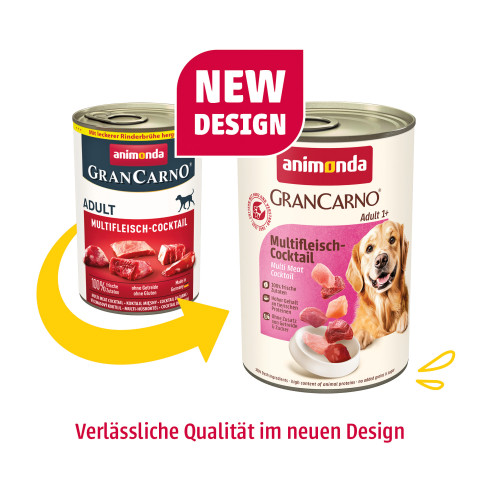
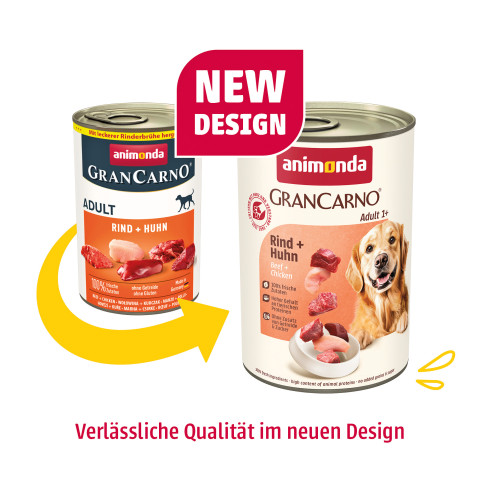
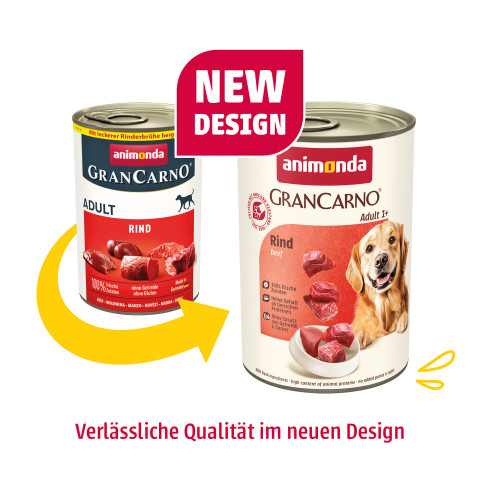
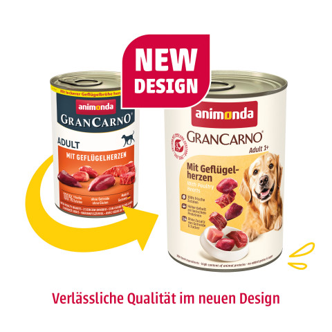
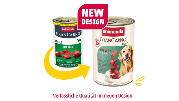
As one of the leading suppliers of high-quality pet food in Germany, animonda presents its new brand identity. With the relaunch of its logo, the company is sending a clear signal of modernity, authenticity and customer focus. The new design stands for quality, transparency and animal welfare – values that have always characterised animonda. Clear typography, harmonious colours and a minimalist appearance create a visual identity that conveys trust and premium quality.
‘The logo relaunch is an expression of our strategic development and our commitment to creating pet food with heart and mind,’ says Marco Lubberich, CEO of animonda. The new primary colours red and yellow are consistently used throughout the corporate design and underline the brand values of sustainability, responsibility and emotional closeness between humans and animals.
With its new image, animonda is strengthening its position in the international market and presenting itself as a modern, future-oriented partner for pet owners.

 Menü
Menü





 Print - digital - online